A logo is not only the face of a business, but also a symbol of the era in which it was created. Recognizing logo design trends is an essential part of choosing a logo design style which feels fresh and relevant, and there’s no better time to get on track than the dawn of the new year.
9 logo design trends to watch in 2018
—
- Responsive, contextual logos
- Architectural inspiration
- Fun! (Creating an energy and vibe.)
- Pushing metaphors to the extreme
- Experimental techniques in typography
- Grid-based logos
- Layering and masking of patterns and color
- Simple typography paired with monograms
- Fundamental geometric shapes
1. Responsive, contextual logos
We are living in an age where logo designers must not only create aesthetically pleasing designs, but must also have deep understanding of the different contexts in which those designs might be applied. Posters, business cards, signs, installations, advertisements and packaging are only a few examples of places a logo can end up. In 2018 keep your eyes peeled for an increased awareness to context in logo design.
via Studio Mast.
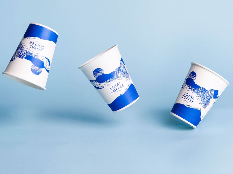
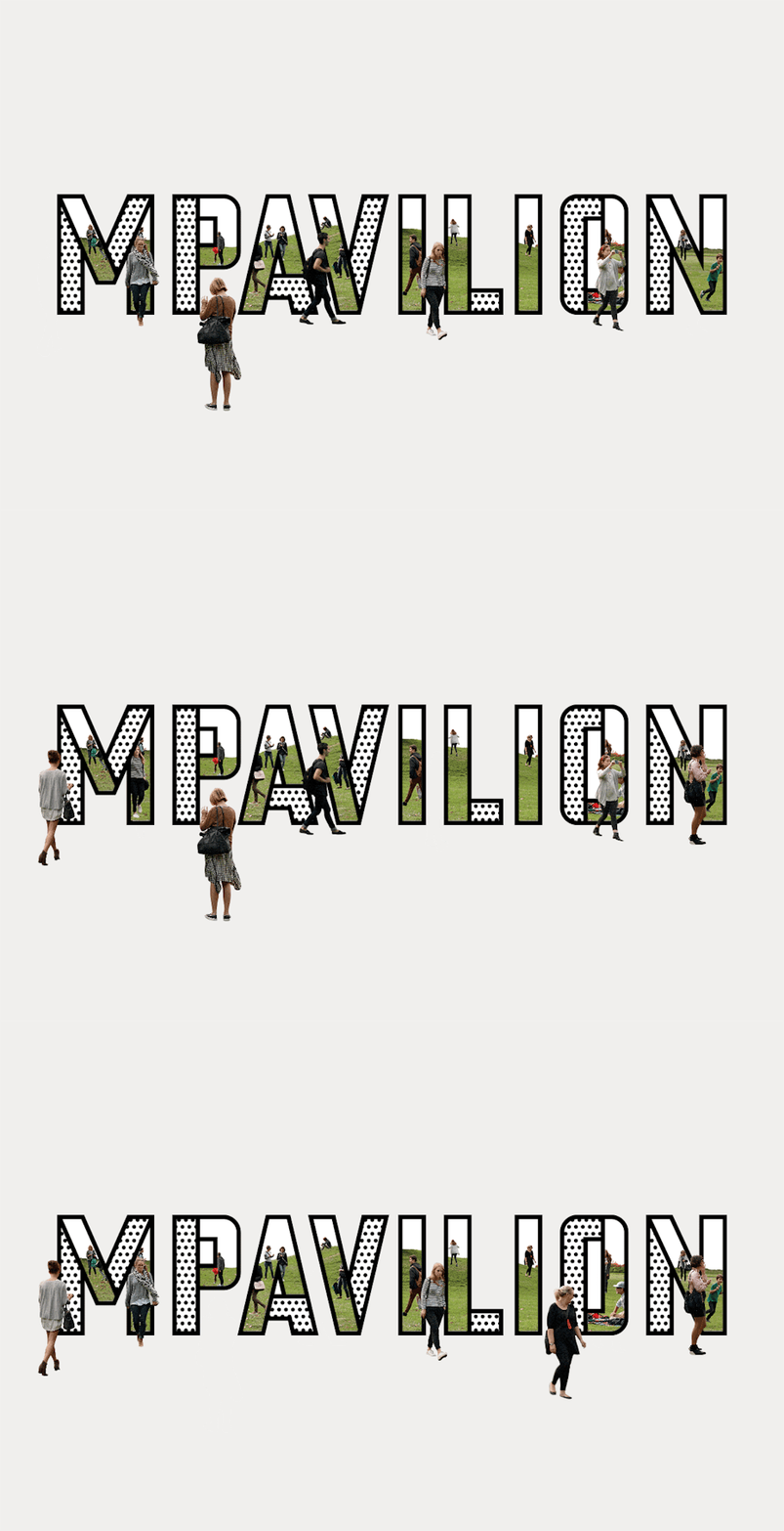
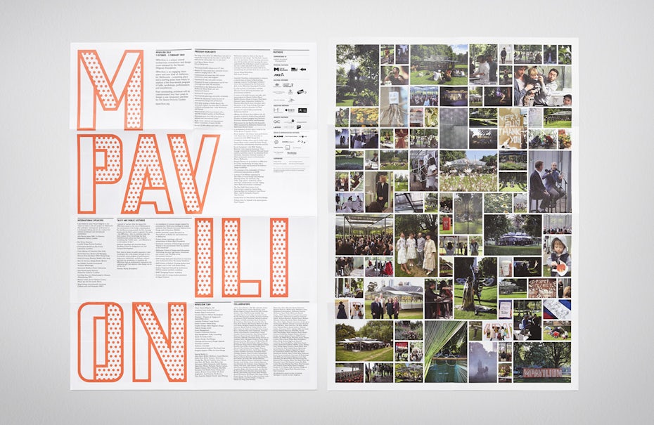
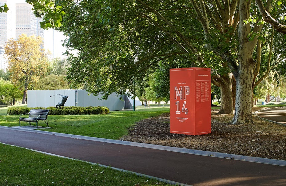
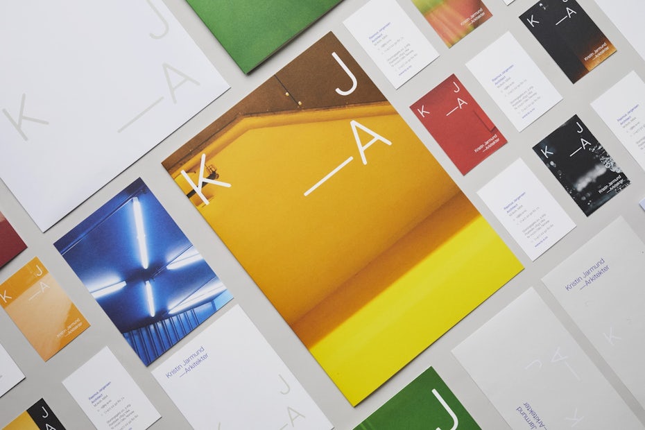

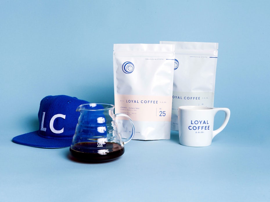
One excellent example of awareness to context can be seen in Snøhetta‘s logo design for Kristin Jarmund Architects, which takes the abbreviation “K J – A”, and allows it to adapt to various layouts upon photographic backgrounds. In this way, the logo accommodates concepts of architecture both metaphorically and visually. Another thoughtful example of awareness to context comes in Studio Mast’s logo design for Loyal Coffee, which includes several iterations of line-based illustration that adapt to coffee cups, menus and coffee bean packaging.
2. Architectural inspiration
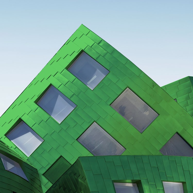
While basing a logo design off of an architectural design is nothing new, it’s resurging in popularity in clever, innovative ways. Physical space has always been important in creating a brand identity (think how every Starbucks and Apple store “feels” the same). As we move into an increasingly digital world, designers are finding ways not only to capture the look of architectural landmarks, but also how to embody the concepts behind the physical manifestation of the brand through their visual interpretation. For example ….
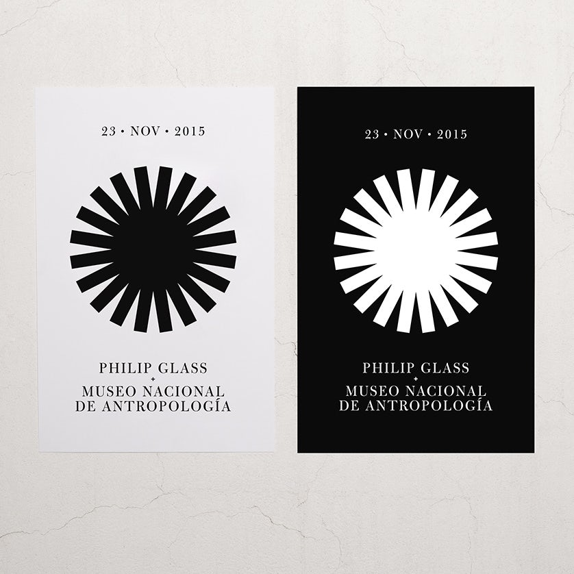
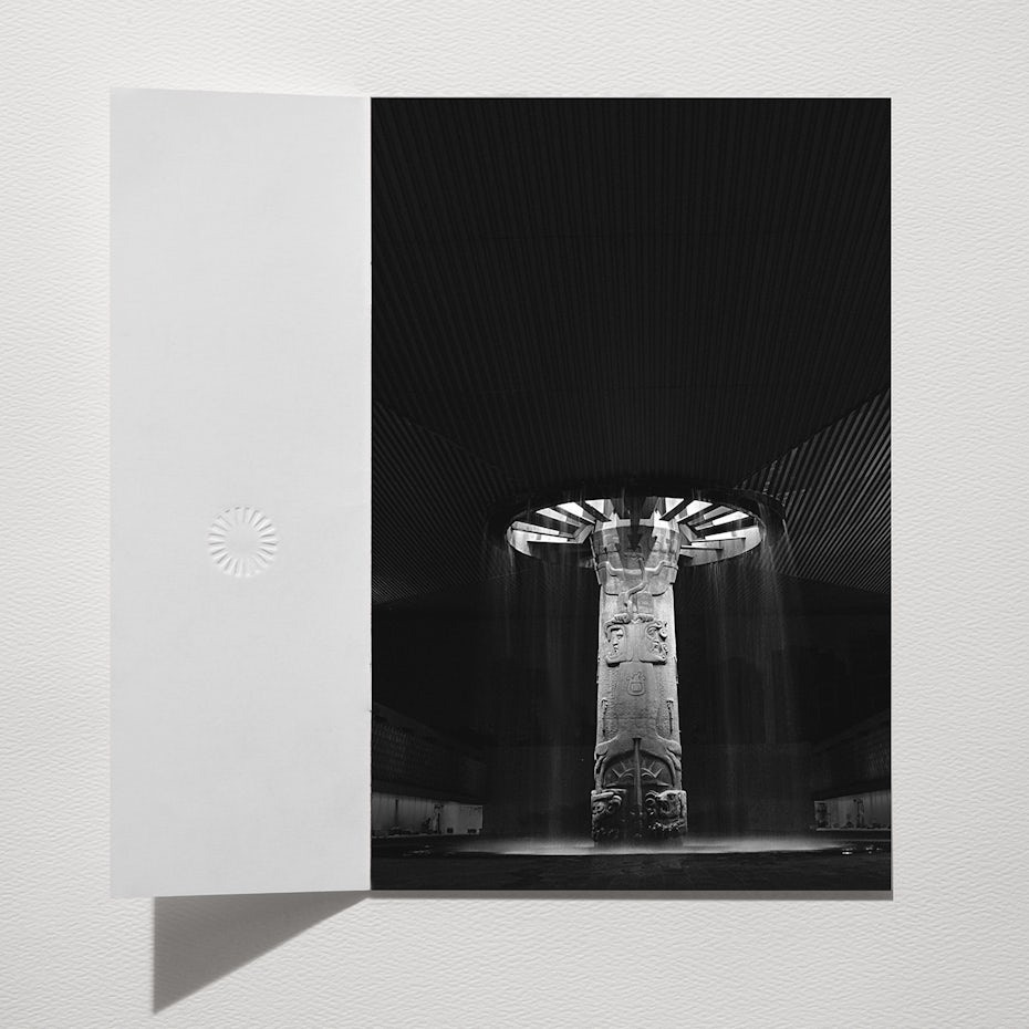
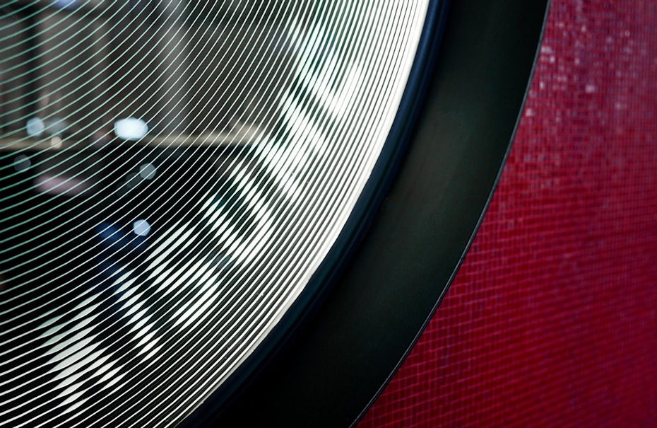
A wonderful example of this trend is Savvy’s logo design for Philip Glass’s concert in the historic National Museum of Anthropology in Mexico City. The shape of the logo is drawn from the main feature of the building, the “Umbrella Fountain,” designed by Mexican Architect Pedro Ramírez Vasquez. This feature is, in essence, a geometric, circular skylight which lets light pour in around a large engraved pilar. It is both massive and stunning—qualities which are referred to in the bold, black and white rendering of the logo. At the same time, the impact of the logo speaks to the qualities of Philip Glass’s work: his music is emotional intensity, and explores its relationship with physical space.
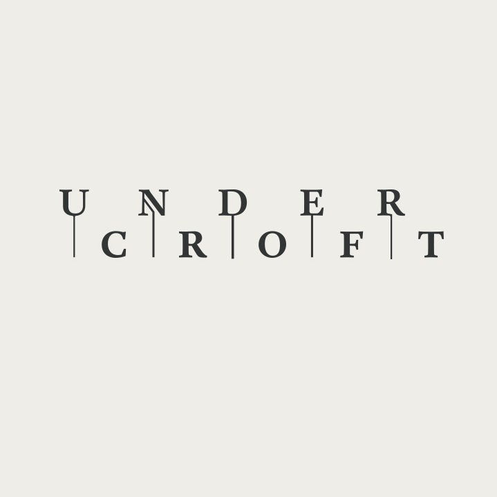
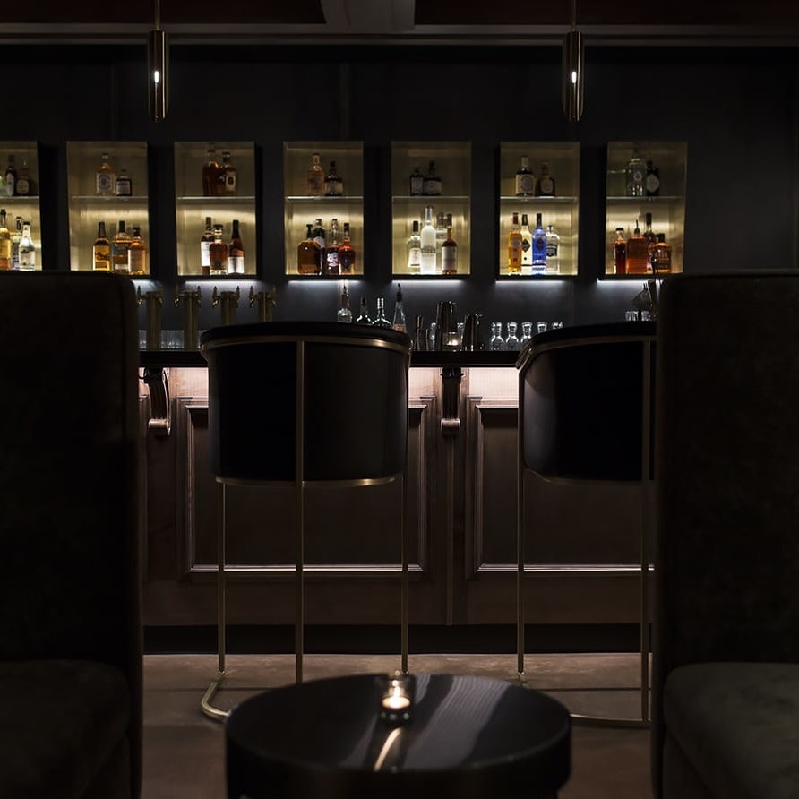
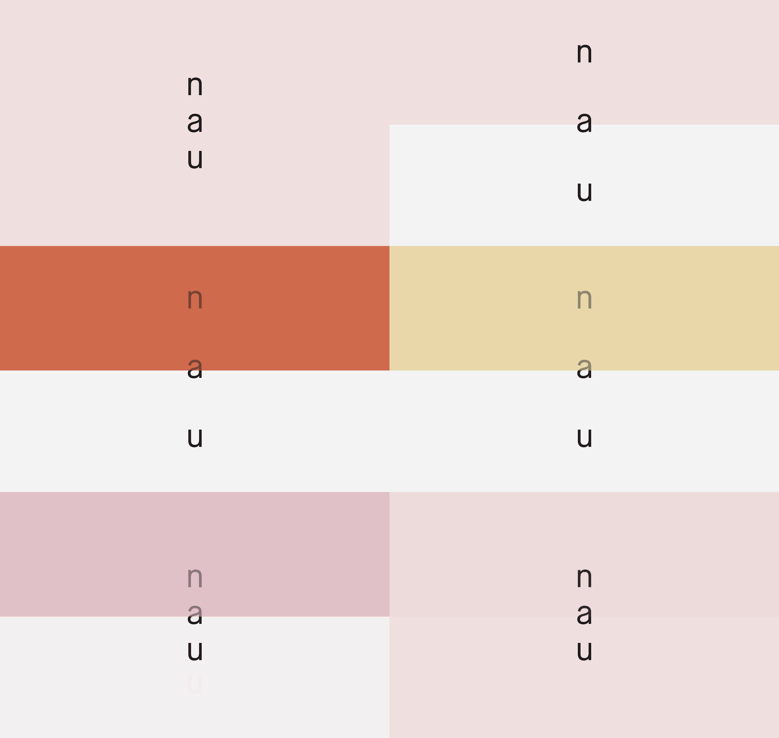
Another nice example of architecture-based logo design can be seen in Föda’s work for Undercroft, a secret cocktail bar underneath a historic church. The bar is entered through a dim archway then down a small stairwell. Inside the bar, there are multiple shelves for storing liquor and books. The logo reflects many of these architectural aspect by creating levels, with lines “pointing” to the underneath layer. The angled line in the “N” even hints at the idea of a small stairwell.
3. Fun! (Creating an energy and vibe.)
Fun is something that sells just about as well as sex. While fun has always been a staple in logo design, the current state of economic uncertainty might be inspiring people to counteract negativity with funner designs than ever! Fun is hard to resist, and it comes in the form of bright colors, good vibes and cute characters. This year we hope to see fun logos left and right, making 2018 a year that makes you smile!
via Bedow.

via Perky Bros.
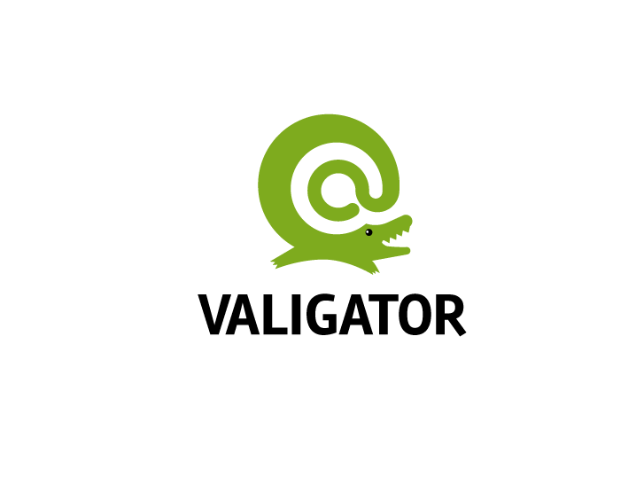
Logo de Valigator réalisé par dan.stiop.

Logo de Cosmic tea réalisé par giyan.
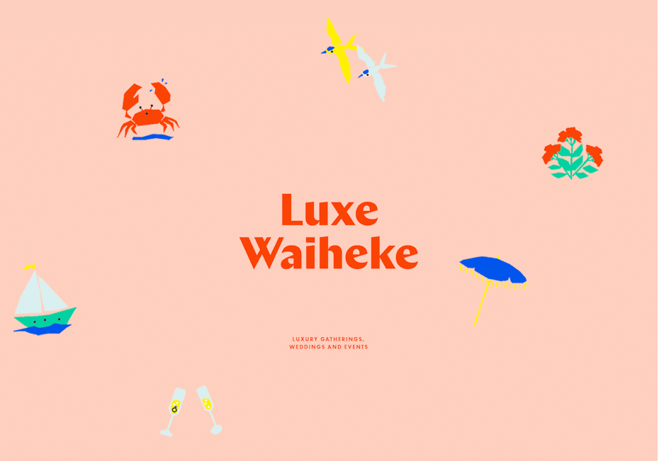
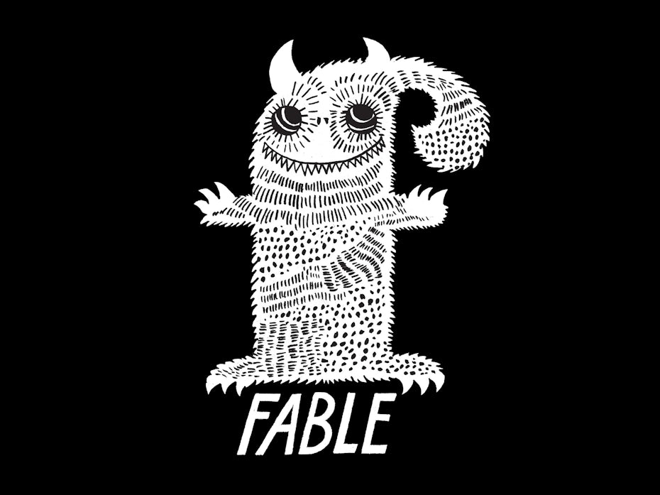
There are many ways to create fun in a logo. Some of our favorite examples from this last year include A Friend Of Mine’s design for Luxe Waihek, which contains joyful custom typographic characters (notice how the “e” makes a laughing emoji style face), Bedow’s logo for Fable Skateboards, which contains a whimsical smiling monster and 99design’s own giyan’s design for Cosmic Tea Co. which features an astronaut sipping tea in space!
4. Pushing metaphors to the extreme
Metaphors are certainly not new to logo design, but the ever-expanding reach of curiosity and creative exploration in the design community has recently caused them to become a focal point of deep creative exploration. This year we should see logo designers pushing metaphors to their extreme, with thoughtful and clever concepts that give more depth to a logo than visuals can alone.
Logo avec métaphore du lacet, via Perky Bros.


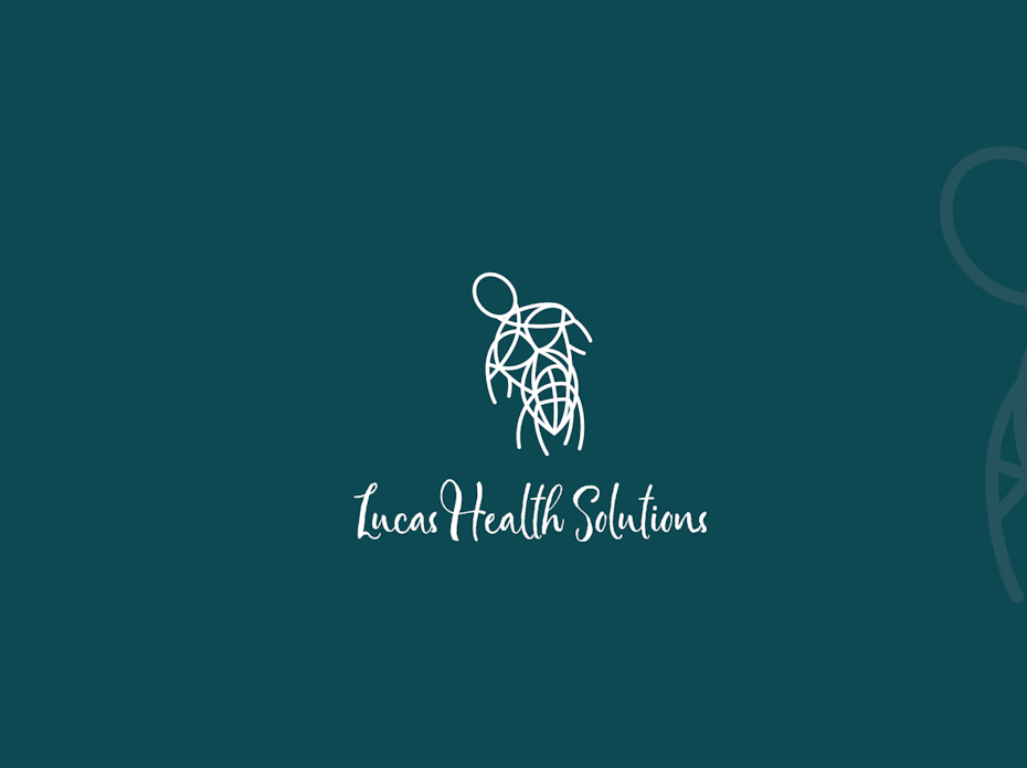
Les traits du corps, réalisé par Arthean.

Logo inspiré des molécules chimiques, via InHouse.
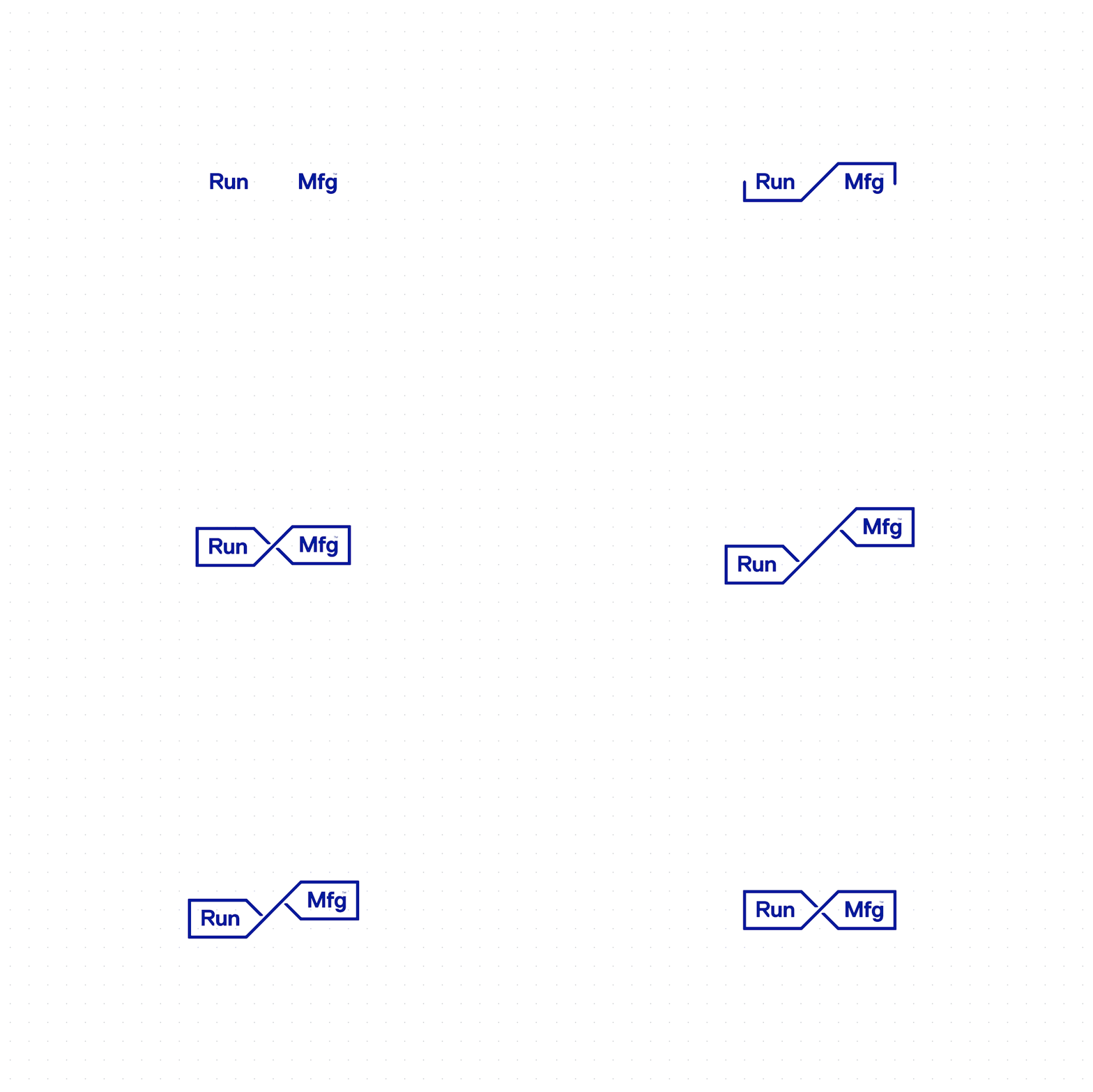
Above, the designers at Perky Bros have created a perfect dual metaphor for Run Mfg, where a shoelace not only nods to a running shoe but also depicts paths or routes. This not only explains what Run Mfg does (running event planning/design), but it also opens up for creative possibilities in the branding.
We also love how InHouse has broken out the typographic characters of “Pacific Potion” to create a beautiful “chemistry diagram”. This creates a metaphor of wine as chemistry, and works especially well for a wine brand that pays especially detailed attention to the ingredients, ratios and science in their wine making process.
5. Experimental techniques in typography
From old style to sans serif, typography has always been subject to experimentation—from the development of new typographic shapes to the modification of pre-existing typefaces using illustrative or photographic techniques. It doesn’t end there either. This upcoming year we should see continued experimentation in typography, with both innovative concepts and new realizations of how pre-existing technology can apply to this medium.
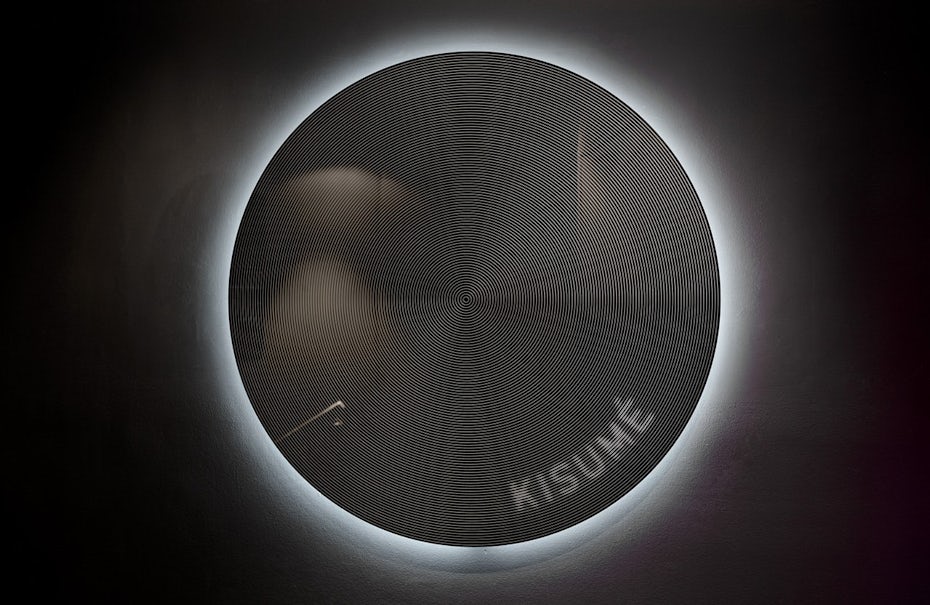
Logo avec ligne de délimitation, via Fabio Ongarato Design.
Logo avec effet d’écho, réalisé par HeART.
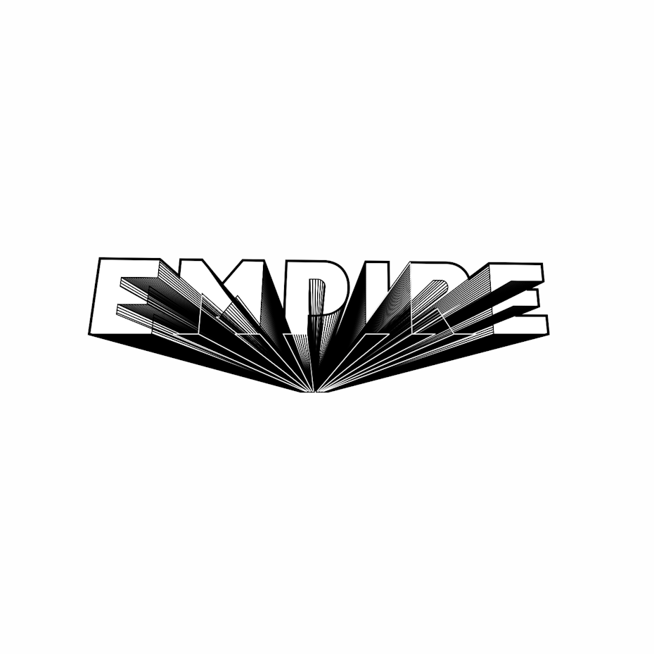
Logo avec technique expérimentale de 3D réalisé par Slav-che.
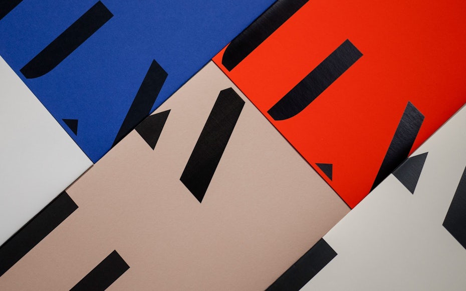
Check out how the typographic treatment for Kusumé utilizes an experimental, yet tasteful use of the line-threshold process (a dated threshold technique intended for printing grayscale photos using only black ink). This creative use of the technique brings the typography to a new level which feels unconventional, organic and intriguing—perfect for a cutting edge Japanese restaurant.
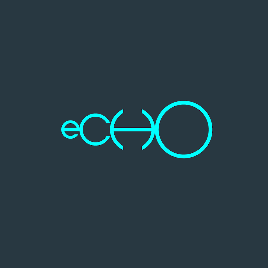
In another experimental example, 99designer HeART changes the scale of each circular letterform in the logo for echo to create, you guessed it, a visual echo. It’s a new technique in typography that we haven’t seen yet and that’s exciting! We expect (and hope) to see more in 2018.
Lastly, we love how Bond’s logo design for Heritage pushes broken letter forms to the extreme, where typography “dissolves” into abstract shapes.
6. Grid-based logos
Grids have played the role of backbone in graphic design ever since Josef Müller-Brockmann laid out the fundamentals of theory on the subject in 1981. Grids have the power to portray logic, theory, control and perfection. In a sense, it’s a trend that’s never ended—only come and gone in waves. Based on designs we’ve seen of late, we can expect a healthy serving of very obvious grids in logo design this year.

Logo coloré basé sur un système de grille réalisé par ludibes for Riskby.
via Michael Leyman Bēhance.
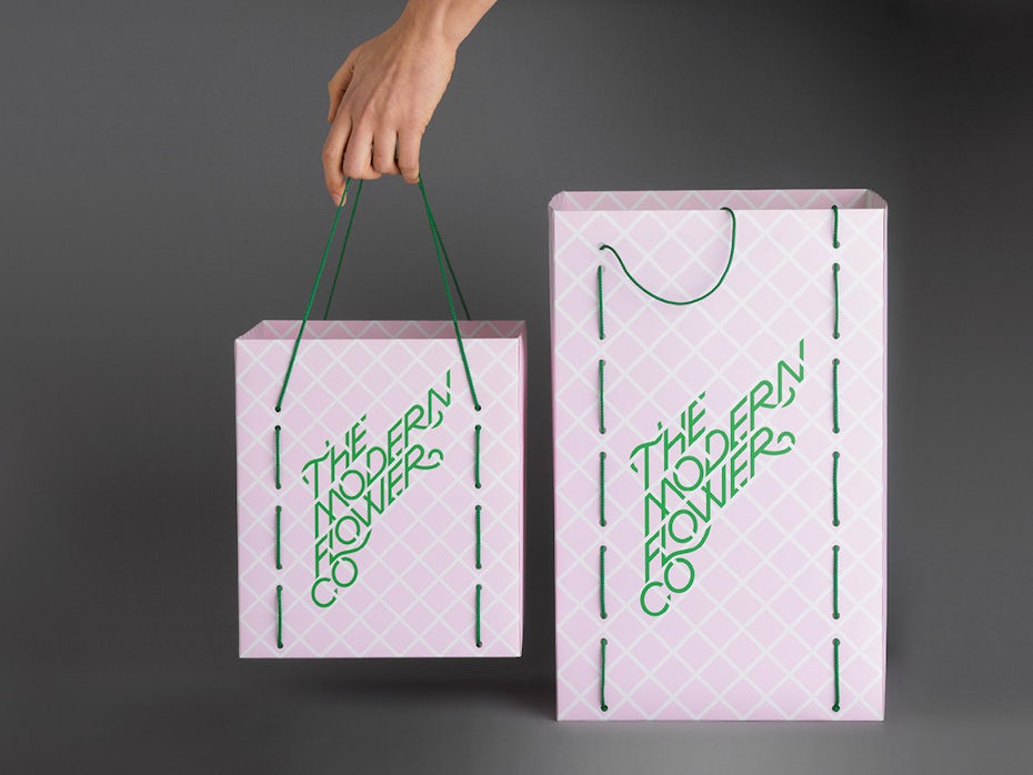
via A Friend of Mine.
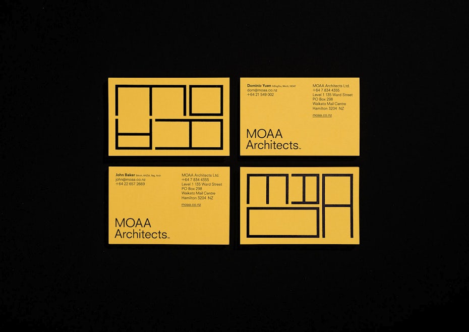
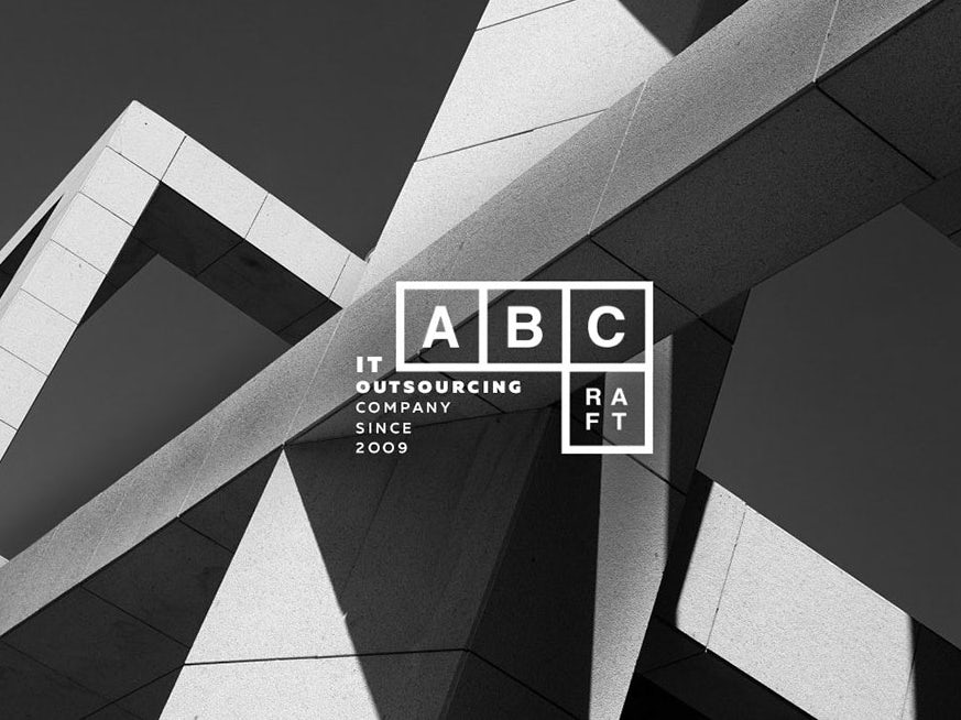
Take for example how the lines which compose the typographic letters of the MOAA logo become the grid itself. Or how the grid-based “trellis” which weaves through the typography of The Modern Flower Co logo creates a wonderful counterpoint to the curves and swirls of the letterforms. Lastly, we love how the grid in the ABCraft logo speaks to how fundamental the brand name and values are. Expect the grid to appear in many new and interesting ways in 2018!
7. Layering and masking of patterns and color
Layering and masking are a sophisticated techniques that involve using patterns to reveal, or contain, additional content within shapes. It’s often subtle and can easily go under the radar. With that said, this technique has a lot of room for experimentation in both abstract and conceptual approach. That’s why we’re putting the spotlight on it.

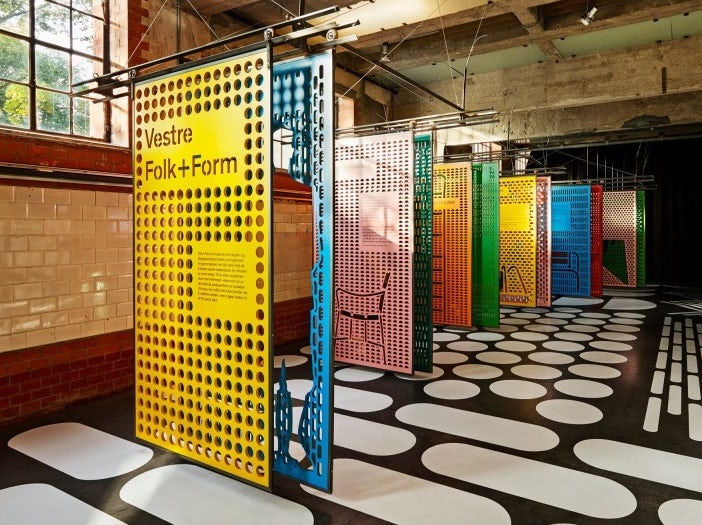
via Snøhetta.
via Dom Layton.
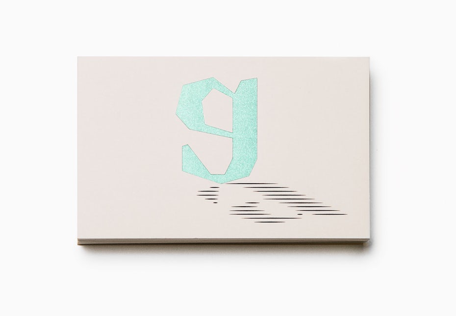
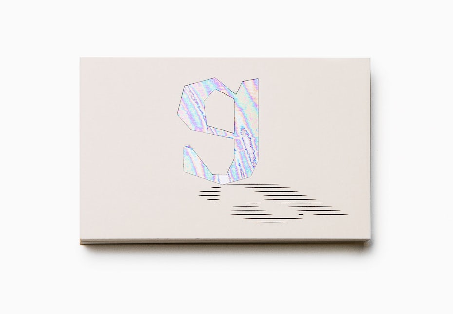
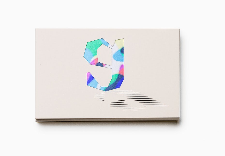
One of our favorite recent examples of masking/layering in logo design is Bedow’s design for photographer Gustav Almestal, which layers different abstract patterns behind the “G”. In this example, the letter “G” not only masks the patterns, but it becomes a statement about the lens, or eye of Gustav Almestal. Additional it hints at concepts of light and shadow. Powerful!
8. Simple typography paired with monograms
There’s always be a place for the classics. Lately we’ve been seeing a resurgence of simple, well-crafted typefaces paired with monograms. Designers are honing their skills with classic typefaces of the past, which involves giving precise attention to the basic parameters of logo typography: typeface choice, kerning and letter-spacing.
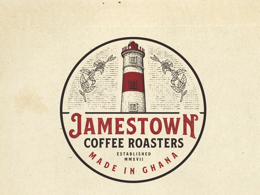
Logo avec typographie simple et classique réalisé par Tee™ pour Jamestown Coffee Roasters.
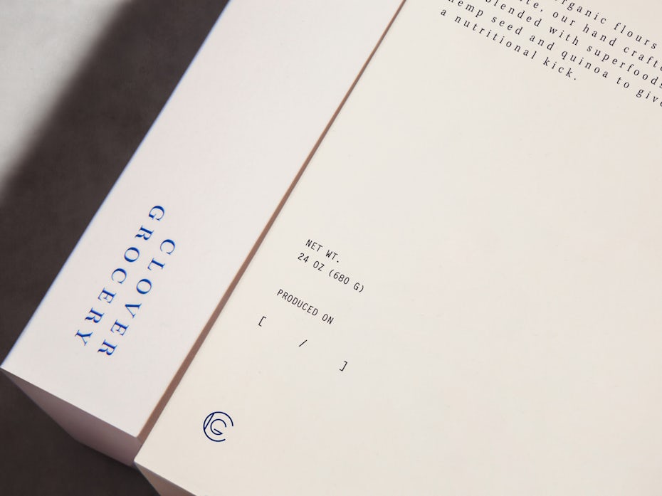
via Savvy.
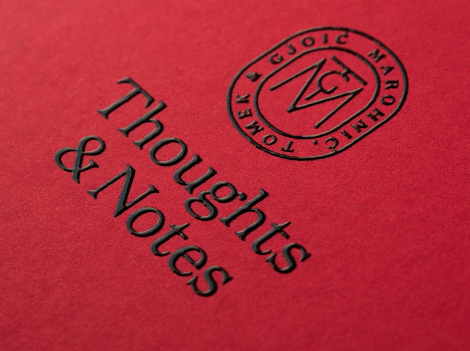
via Bunch.
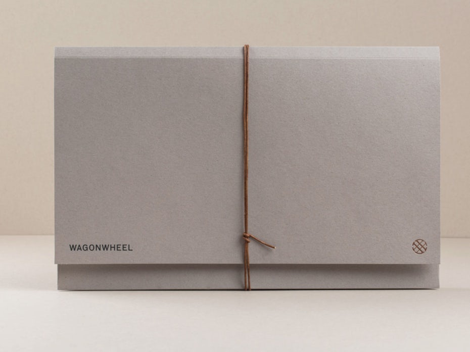
via Perky Bros.
Showcased above are some brilliant examples of this trend. The typeface for the Wagon Wheel is simple and unmodified. It’s clear that the typeface choice was carefully made: Its character shapes nod to the past (think wagons) but also holds aspects of modernism to bring the brand into current times. Further, notice the perfectly balanced kerning in logo. You can bet your buck that the kerning didn’t look that good without some keen adjustment.
In another superb example, the typeface chosen for the Marohnić Tomek & Gjoić relates to the early Monotype era of typography. The typeface is beautiful on its own, and when treated with a careful eye results in a powerful logo and monotype that champions classic simplicity.
9. Fundamental geometric shapes
Typography isn’t the only aspect of logo design receiving simplification these days. The actual shapes used in logos have as well, with an increased focus on minimal geometry, or geometry created with a less-is-more attitude. When you look at some of the advantages of this style—like branding versatility, easy readability and instant impact—it becomes clear that we should be seeing more in 2018!
Logo réalisé par zotov.Agency™ pour FEEMO.
Logo réalisé par Angstrom Alliance.
via Bunch.
A great recent example of minimalist geometry can be seen in Kurppa Hosk’s logo design for office space design company Ogeborg. The logo takes the concept of a sample book or swatch book (commonly seen in the paint section at hardware stores) and turns it into a simple and recognizable geometric shape. Customers who see this shape should instantly understand that Ogeborg is a company that can help them with interior design.
2018: a year of contradicting logo trends
—
2018 looks to be an interesting year for logo design trends. We see both experimental typography and a return to basics. We see simple grids and geometry, as well as complex applications and layering of color and pattern. It looks to be a year where boundaries are pushed, and we can’t wait to see what the designers of the world come up with!


